1. New custom file structure
Logically grouping of contents and common assets.
Heads up! 'bootstrap.less' has been renamed to 'default.less', which compiles to 'default.css'.
  root/
  ├── css/
  │   ├── default.css
  │   ├── default.min.css
  ├── js/
  │   ├── global.js
  │   ├── bootstrap.js
  │   ├── bootstrap.min.js
  ├── img/
  │   ├── glyphicons-halflings.png
  │   ├── glyphicons-halflings-white.png
  ├── ico/
  │   ├── favicon.ico
  │   ├── apple-touch-icon-57-precomposed.png
  │   ├── apple-touch-icon-72-precomposed.png
  │   ├── apple-touch-icon-114-precomposed.png
  │   ├── apple-touch-icon-144-precomposed.png
Please note that all JavaScript plugins require jQuery to be included.
2. What's included
Bootstrap comes equipped with HTML, CSS, and JS for all sorts of things, but they can be summarized with a handful of categories visible at the top of the Bootstrap documentation.
Docs sections
Scaffolding
Global styles for the body to reset type and background, link styles, grid system, and two simple layouts.
Base CSS
Styles for common HTML elements like typography, code, tables, forms, and buttons. Also includes Glyphicons, a great little icon set.
Components
Basic styles for common interface components like tabs and pills, navbar, alerts, page headers, and more.
Javascript plugins
Similar to Components, these Javascript plugins are interactive components for things like tooltips, popovers, modals, and more.
List of components
Together, the Components and Javascript plugins sections provide the following interface elements:
- Button groups
- Button dropdowns
- Navigational tabs, pills, and lists
- Navbar
- Labels
- Badges
- Page headers and hero unit
- Thumbnails
- Alerts
- Progress bars
- Modals
- Dropdowns
- Tooltips
- Popovers
- Accordion
- Carousel
- Typeahead
In future guides, we may walk through these components individually in more detail. Until then, look for each of these in the documentation for information on how to utilize and customize them.
3. Basic HTML template
With a brief intro into the contents out of the way, we can focus putting Bootstrap to use. To do that, we'll utilize a basic HTML template that includes everything we mentioned in the File structure.
Now, here's a look at a typical HTML file:
<!DOCTYPE html>
<html>
  <head>
    <title>Bootstrap 101 Template</title>
  </head>
  <body>
    <h1>Hello, world!</h1>
    <script src="http://code.jquery.com/jquery-latest.js"></script>
  </body>
</html>
To make this a Bootstrapped template, just include the appropriate CSS and JS files:
<!DOCTYPE html>
<html>
  <head>
    <title>Bootstrap 101 Template</title>
    <!-- Bootstrap -->
    <link href="css/bootstrap.min.css" rel="stylesheet">
  </head>
  <body>
    <h1>Hello, world!</h1>
    <script src="http://code.jquery.com/jquery-latest.js"></script>
    <script src="js/bootstrap.min.js"></script>
  </body>
</html>
And you're set! With those two files added, you can begin to develop any site or application with Bootstrap.
4. Examples
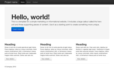
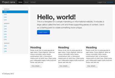
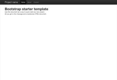
Move beyond the base template with a few example layouts. We encourage folks to iterate on these examples and not simply use them as an end result.
What next?
Head to the docs for information, examples, and code snippets, or take the next leap and customize Bootstrap for any upcoming project.
Visit the Bootstrap docs Customize Bootstrap

